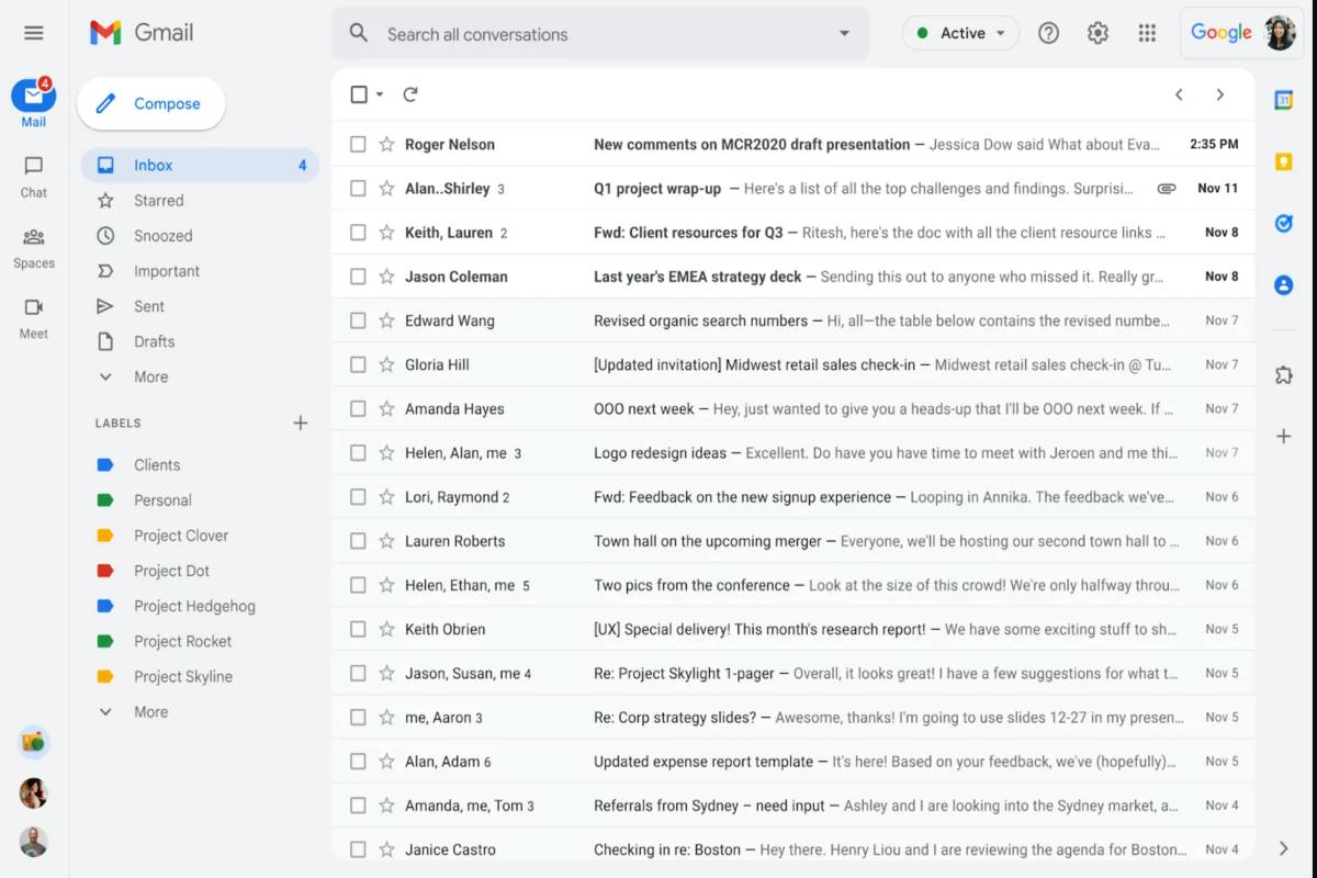
According to the blog post, anyone with standard accounts, Workspace accounts (including Starter, Standard, Plus, Enterprise Standard, Enterprise Plus, Education Fundamentals, Education Plus, Frontline, or Non-profit account), G-Suite Basic and Business licenses should start seeing the update soon. The people with scheduled release domain may have to wait until February 28, 2022, for the rollout. It looks like the new design will be a part of all Gmail accounts by April 2022. To see if you have received the update, you may click the cogwheel at the top right of your Gmail and access ‘quick settings’. Click ‘Try out the new Gmail view’ before reloading your web app.
Main Features of Gmail New Design
The key difference in the new Gmail makeover is a left-aligned bar that houses Mail, Chat, Spaces, and Meet. With this, Gmail provides an integrated view of all key services into one place and reduce the effort to switch between them. There is no more saga of extra tabs or windows. Instead, it all happens from a single interface. The new design has a new app menu interface that allows users to access all of your email, chats, Spaces, and meetings from one place, enabling seamless switching between them. If you wonder if the menu on the top left would collapse the app menu, it will not. The app menu seems to remain persistent in the new design. Google has integrated a new notification bubble on the bottom-left for unread chat messages. Clicking the bubble will open your message as a pop-out or in the whole window. The status indicator for chat has been moved to the top-right of the screen in the new design, and it looks like a status indication for the entire Google Account and not chat alone. Besides the rollout of the makeover, Google has updated its Gmail Support site to help customers understand how to utilise the new Gmail Integrated View. Did you receive the new Gmail makeover? If so, let us know in the comments.
